We are looking for someone to work with on improvements to our website. This person would ideally have familiarity and expertise in website design, WordPress, WooCommerce, Child Theme Development, PHP & CSS, SEO and specifically Yoast SEO.
Here is a list of things that we think needs work on our website, somewhat by priority. Toggle to see discussion for each topic. We are open to additional suggestions and opinions about implementation.
Logo Needs Adjustment
Our logo shows up cropped on mobile displays. Whatever needs doing so that it shows up right on both desktop and mobile. Logo text is also fuzzy/rasterized and we would like it to be clear. We have associated files.
Navigation Menu Styling
The hover and active page icon color needs to be changed from teal/blue to standard orange of site. This also applies to the Portfolio navigation buttons as well as the Shop hover link colors. I guess finding where the teal color is referred to in the main style sheet and making our orange color default would be ideal.
Main Page
- The display of recent articles at the bottom of the main page, below Recent Projects, needs the heading “Recent Articles” and a button “View Journal” that resembles the Recent Projects Heading and View Portfolio button.
- This basic template part for “Recent Articles / View Journal” needs to be updated for all posts throughout the website.
- The “Recent Articles” template part should query from the “journal” category only, not all posts – IMPORTANT.
- Larger improvements to the main page would probably be ideal but we haven’t yet had time to think about this.
Site Footer
- Needs more contrast and styling.
- As a first concept, we’d like to see a light gray background behind the whole footer with black text and orange links. We might want to tweak these colors after we see it. We’d like to add a third column with newsletter sign-up and social media links. See bottom of Aveda website for an example.
- Content currently driven by a page include from WP Menu -> Theme Settings
Shop Pages
- Improve layout and presentation of catalog
- Ideally text for Categories lines up.
- Comment out the number of products in a category.
- Many more products need to be added. We will be working on this.
- Product Pages
- Fix where “Related Product” is showing up. On desktop, it looks fine on Barrel Oven Book product page but jarbled on the Masonry Heater Core Plans page, for example.
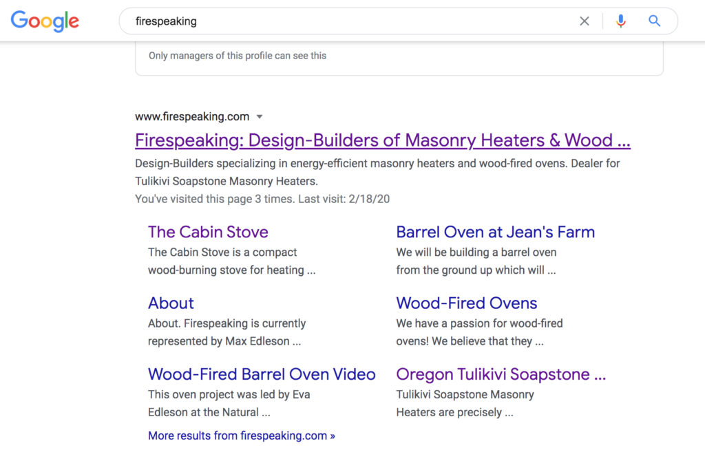
Google Search Result
Post & Portfolio Page Styling
If you go to any sample article (like this one) or portfolio post, the navigation menu changes from the one shown on pages to a condensed one. This is confusing. We would prefer that our whole website have a unified “app” feel with the same navigation bar on the main page and shop showing on all content posts. We think we prefer the style of menu as shown on the main page which scrolls away. It could be slightly more compact on content pages.
Thank you. We look forward to hearing from you and receiving a quote for this work.
Future Roadmap
- Add Order Form Capacity:
- https://barn2.co.uk/wordpress-plugins/woocommerce-product-table/

